6

The art of the moving characters (not static backgrounds) of old animated movies such as The Sword in the Stone (1963), The Jungle Book (1967), and The Aristocats (1970) were sketchy. The line work of the animation was left rough, instead of crisp and smooth as seen in animated features of earlier and later animated films.

What was the reason for this? Was it technical limitations of animation technology of the time? Was it some artistic trend (if so, is there a name for it)?

1
  • 2
    Can you find some cels or clips that specifically show what you're talking about to add to your question?
    – Catija
    Commented Dec 30, 2015 at 23:19

2 Answers 2

5

It's probably to do with animation processes. There may have been another reason but I think this was probably why...

In the 1960s the way that inking (outlines) was done in animation changed. Originally it was hand drawn onto the individual cels which took a long time to do. Imagine drawing 350,000 drawings for a single film and then tracing over them all again onto plastic sheets (Snow White).

In 1960, xerography (basically photocopying the paper drawings onto the plastic animation sheets) replaced hand inking. If you've ever used an old photocopier you will know how rough a copied page can look like. Basically, all of the sketchy looking Disney films look sketchy because they were not hand painted and used xerography. In some of these films, like Aristocats, you can even see some of the construction lines.

In 1985, Disney started using a mix of xerography and Animation Photo Transfer process in The Black cauldron. You will notice that the lines start to clean up a bit.

Finally, after The Little Mermaid, Disney switched completely to 100% digital coloring. Goodbye sketchy lines forever!

1
  • 1
    This is the better answer, IMO. Essentially it boiled-down to cost: cheaper to photocopy the drawings than have employees inking them. Commented Sep 19, 2017 at 10:58
12

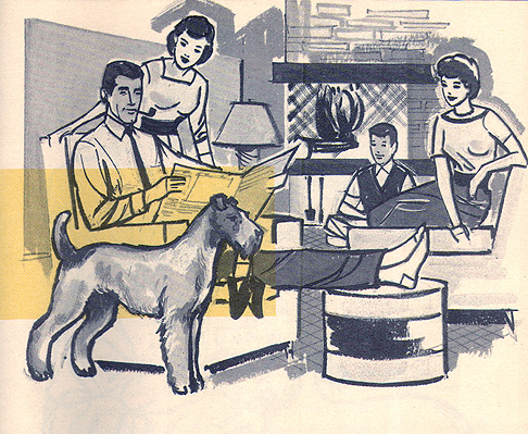
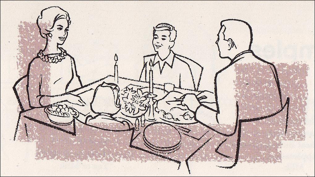
I don't know the answer for sure, but my guess is that it was simply one of the preferred aesthetics of the era. The late 50s and early 60s were full of hand drawn art styles where the roughness of the line was embraced. Random examples:

enter image description here enter image description here

I don't think there is a particular name for this style other than '50s/60s illustration' (era) or 'pen and ink' (medium).

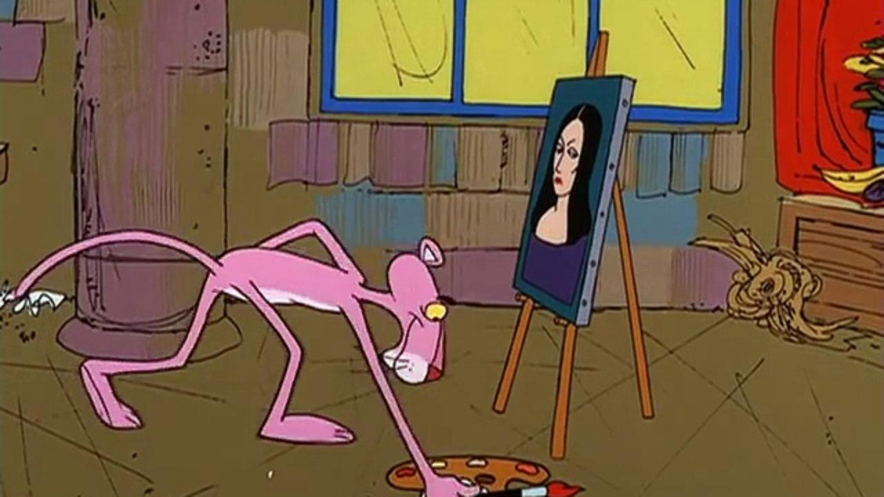
I think one of the highlights of the trend at the time was the great backgrounds used in all of the Pink Panther cartoons during the 60s:

enter image description here

2
  • 2
    I wondered if it were an art trend, versus some new technology. Good call on looking at other art of the era. I did notice that the style seemed to be present in 60s movies, but earlier ones like Snow White (the first feature-length animated film), don't have this style.
    – user23604
    Commented Dec 31, 2015 at 3:14
  • 2
    This is a good answer, but I should note that, by the '60s =budget= made animation prohibitive relative to the return. It's not really that everyone decided they liked a crude look better: It's that that was what was considered a reasonable amount to expend.
    – moviegique
    Commented Sep 6, 2017 at 5:21

You must log in to answer this question.